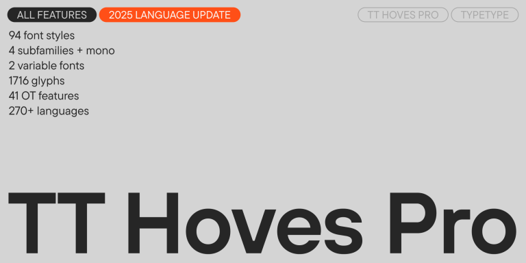
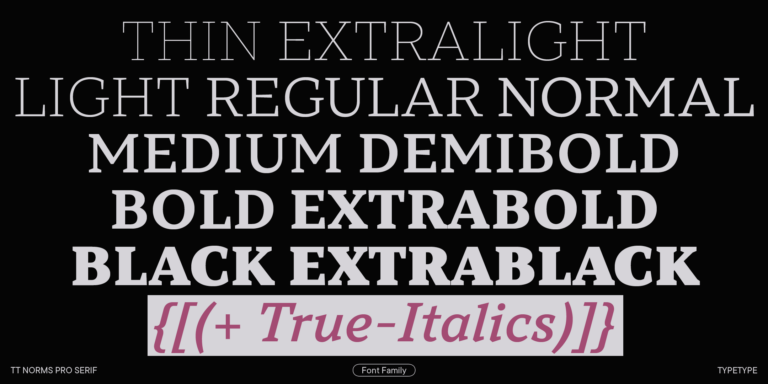
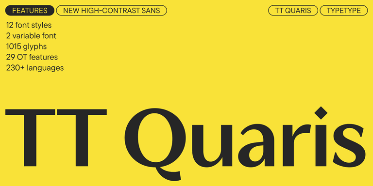
TT Commons™ Pro
Regular
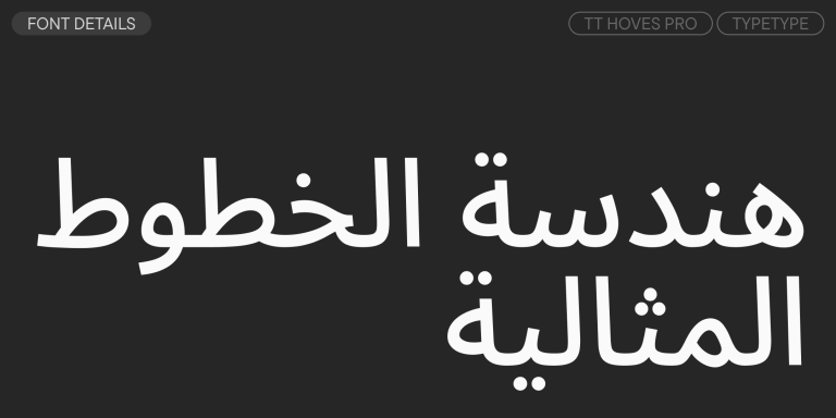
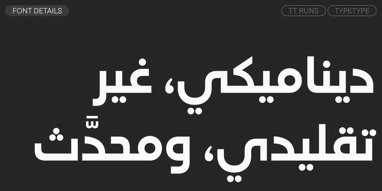
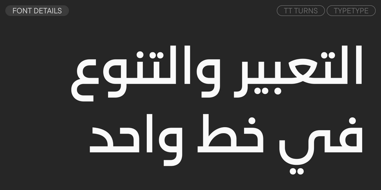
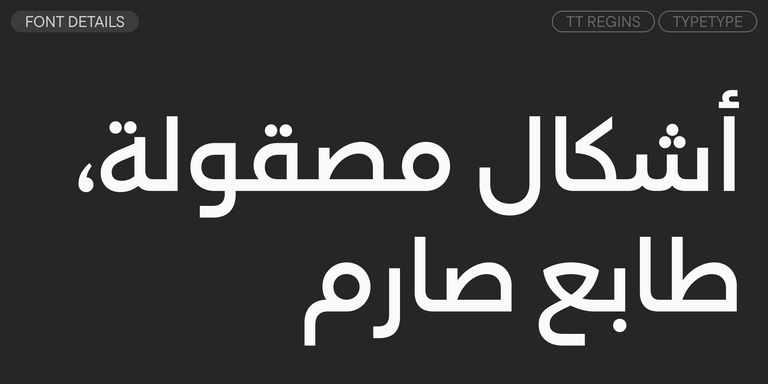
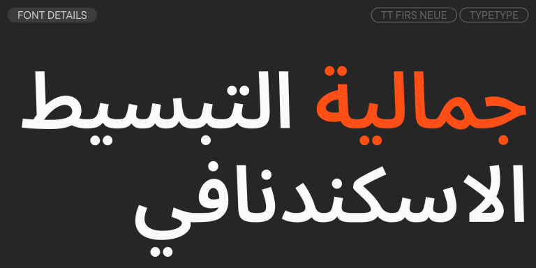
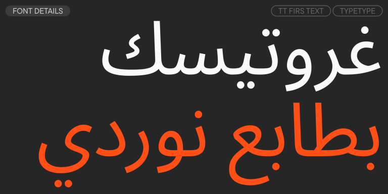
104 أنماط خط
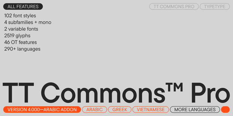
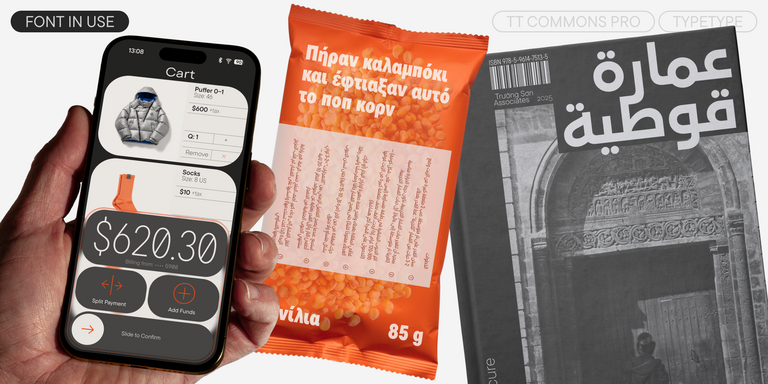

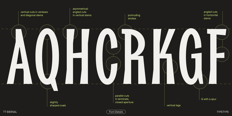
TT Commons™ Pro is a completely redesigned version of the well-established classic font family TT Commons.