الرئيسيةالخطوط والأنماطبدون الذناباتTT Gertika
شراء الخط تنزيل مجاني

TT Gertika

نمط واحد: من $39.99 العائلة الكاملة: 4 الأوزان من $99

هل لديك أي أسئلة حول الخط أو التراخيص؟ اكتب لنا.

اختر الخطوط التي تريدها

اختر الخطوط والتراخيص التي تريدها

ثم، اضغط على زر "إضافة إلى السلة".

25% خصم عند الجمع بين تراخيص سطح المكتب والويب

عرض الحزمة:
لكل نمط $24.75
من  $99
4الأوزان
من  $99
من $39.99
من $39.99
من $39.99
من $89
عرض الحزمة:
لكل نمط $25
من  $75
3الأوزان
من  $75
من $39.99
من $39.99
من $39.99
من $89
1نمط
من $89
من $89

هل لديك أي أسئلة حول الخط أو التراخيص؟ اكتب لنا.

اختر تراخيص الخطوط

يجب عليك تحديد حزمة الخطوط أو النمط قبل اختيار الترخيص.

اختر التراخيص التي تحتاجها.

الترخيص مناسب لأي شخص يخطط لاستخدام الخط لتطوير الشعارات والصور لمواقع الويب، والشبكات الاجتماعية، أو الطباعة، أو الهدايا التذكارية، أو البضائع

تم شراؤها لعدد محطات العمل التي سيستخدم فيها المصمم الخط.

سطح المكتب يتم دفع الترخيص مرة واحدة. النص الكامل للترخيص

حسب الطلب

إذا كنت تخطط لاستخدام الخط في العناوين أو الكتل النصية على موقع المشروع الخاص بك، فاختر هذا الترخيص.

يعتمد سعر الشراء على عدد الزيارات للموقع.

خط الويب يتم دفع الترخيص مرة واحدة. النص الكامل للترخيص

حسب الطلب

لاستخدام الخط في تطبيقات iOS وAndroid وWindows وLinux وأنظمة التشغيل الأخرى.

عند اختيار الترخيص، لا نقوم بحساب عدد تنزيلات التطبيق، بل نركز فقط على عدد التطبيقات التي سيتم استخدام الخط فيها.

التطبيقات يتم دفع الترخيص مرة واحدة. النص الكامل للترخيص

حسب الطلب

مناسب لوضع اللافتات، والإعلانات الرقمية، والملصقات على الإنترنت، وكذلك للإعلان على شبكات التواصل الاجتماعي.

تختلف خيارات الترخيص اعتمادًا على عدد مرات ظهور المواد الإعلانية.

الإعلانات على الإنترنت يتم دفع الترخيص مرة واحدة. النص الكامل للترخيص

حسب الطلب

استخدام الخط لمحتوى الفيديو: في التدوين، أو على قناة YouTube أو التلفزيون، أو في عمليات البث عبر الإنترنت، أو حتى دون الاتصال بالإنترنت.

تعتمد خيارات ترخيص الخط على حجم محتوى الفيديو الذي يستخدم الخط.

البثّ المرئي يتم دفع الترخيص مرة واحدة. النص الكامل للترخيص

حسب الطلب

ترخيص لمطوري ألعاب الفيديو، يسمح لك بتضمين خط في كود لعبة الفيديو.

ألعاب الفيديو يتم دفع الترخيص مرة واحدة. النص الكامل للترخيص

حسب الطلب

مناسب لأولئك الذين سيستخدمون الخط في الكتب الإلكترونية، أو المجلات، أو ملفات PDF التفاعلية، أو المنشورات الأخرى.

الكتب الإلكترونية يتم دفع الترخيص مرة واحدة. النص الكامل للترخيص

حسب الطلب

الترخيص مناسب للاستخدام على المواقع، والتطبيقات الخاصة، حيث يمكن للمستخدمين إنشاء منتج باستخدام الخط المحدد دون ترخيص خط إضافي.

الخادم يتم دفع الترخيص مرة واحدة. النص الكامل للترخيص

حسب الطلب

عندما لا يقتصر الهدف من الخط على مجال استخدام واحد، وتريد استكشاف جميع إمكانيات استخدام المحرف.

بالنسبة لأولئك الذين يشترون هذا النوع من التراخيص، غالبًا ما نقدم إمكانية تخصيص الخط كهدية.

الاشتراك غير المحدود يتم دفع الترخيص مرة واحدة. النص الكامل للترخيص

حسب الطلب
لا عناصر محددة
الإجمالي
$0

TT Gertika

حول عائلة الخط

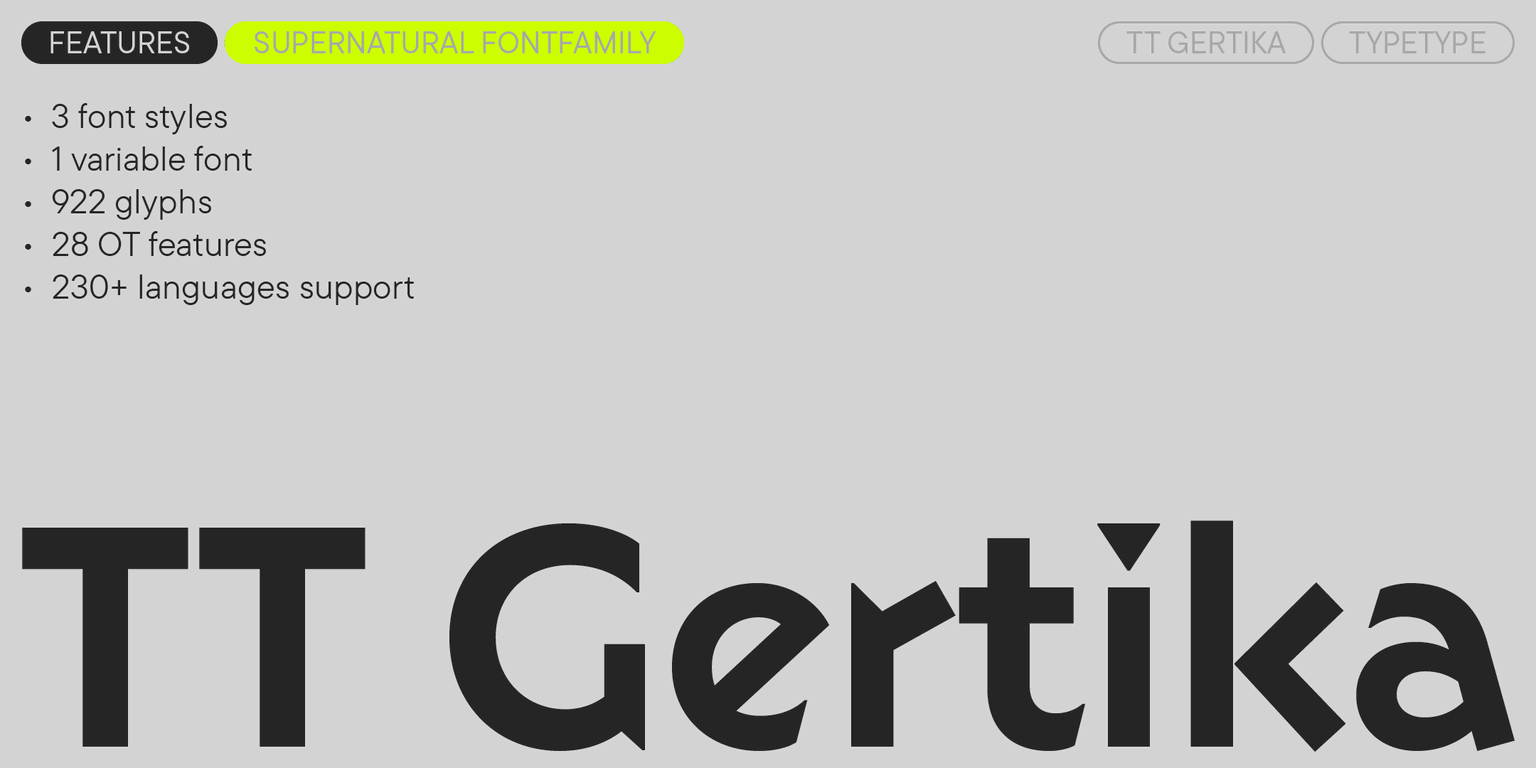
Introducing TT Gertika—our new expressive typeface that blends contemporary and archaic!

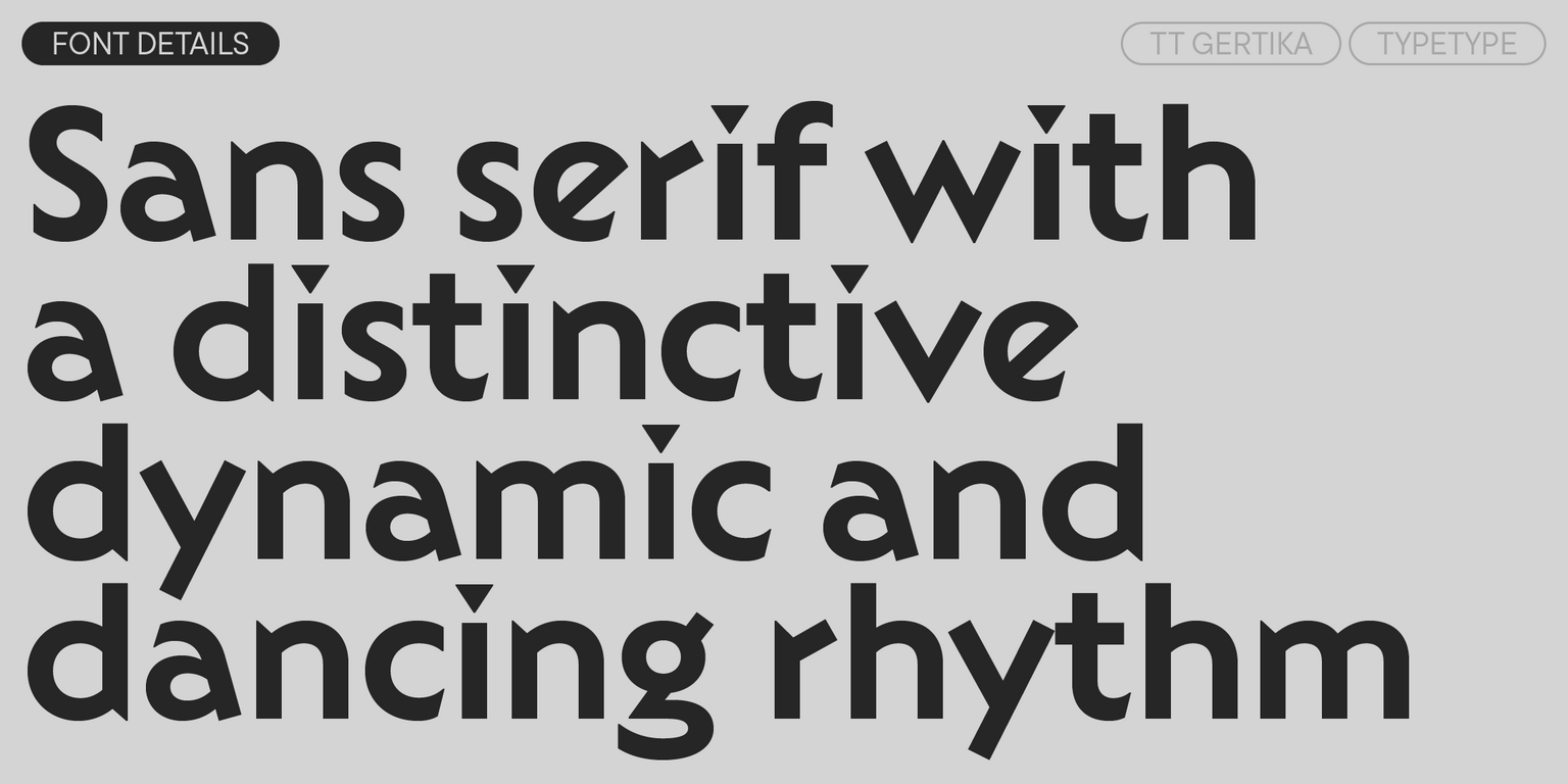
TT Gertika is a geometric sans serif with a dynamic character and a dancing rhythm. This font’s idea originates from the lettering featured on an American poster from the late 1930s. We saw many peculiar and eye-catching details in the letters and decided to reimagine them. As a result, we got a font that alludes to something ancient and primitive while still being modern.

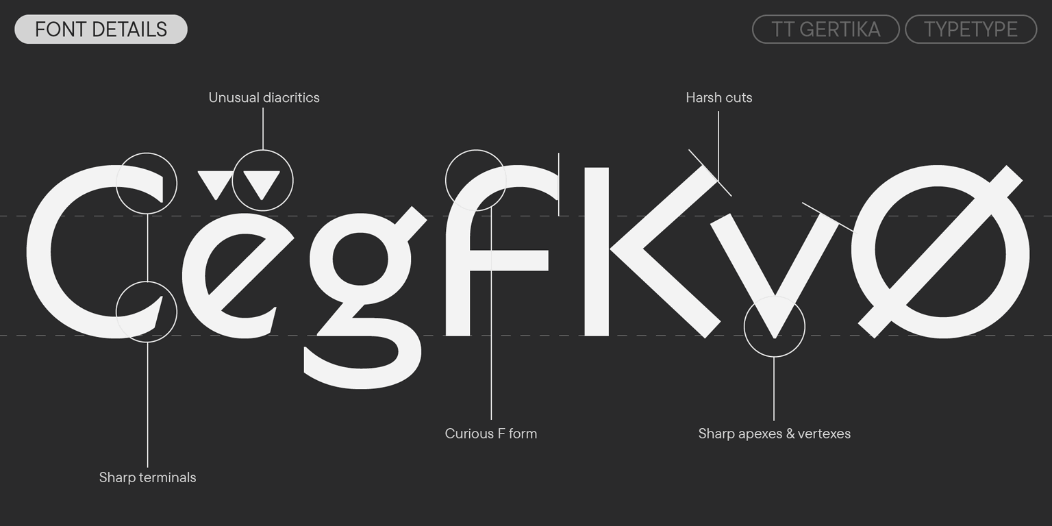
TT Gertika stands out for its rough diagonal stroke cuts at a 90° angle, sharp and “straightforward” intersections of letter elements, asymmetrical, sharp terminals in glyphs like “S”, “C”, and “З”, which contrast with the overall geometric quality of the forms, and noticeably dynamic proportions. It is also curious that we designed different diacritical marks for wide and narrow characters.

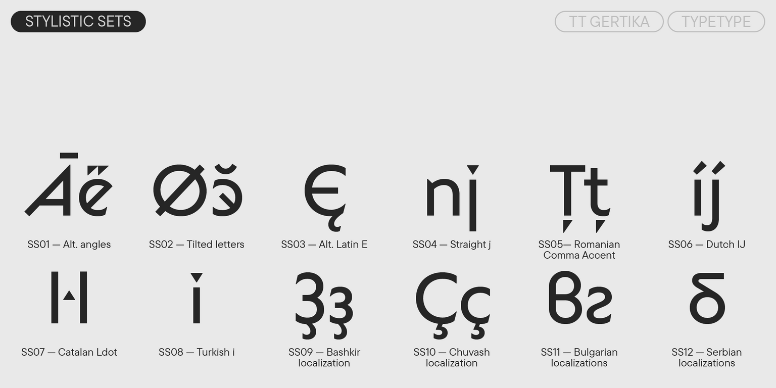
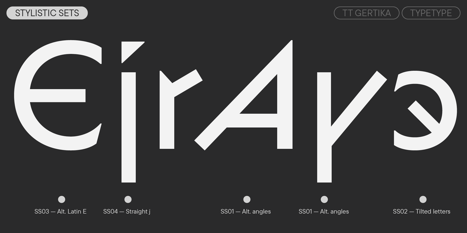
Due to stylistic sets, the mood and visual features of the font may transform dramatically: you can make it look more strict and dynamic or, in contrast, rounded and fluid. In addition, the typeface includes a variable font with a weight variation axis. This makes the mood of TT Gertika even easier to adapt to your needs.

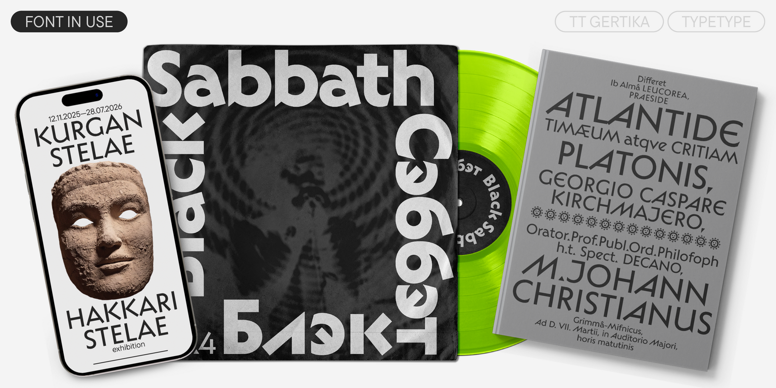
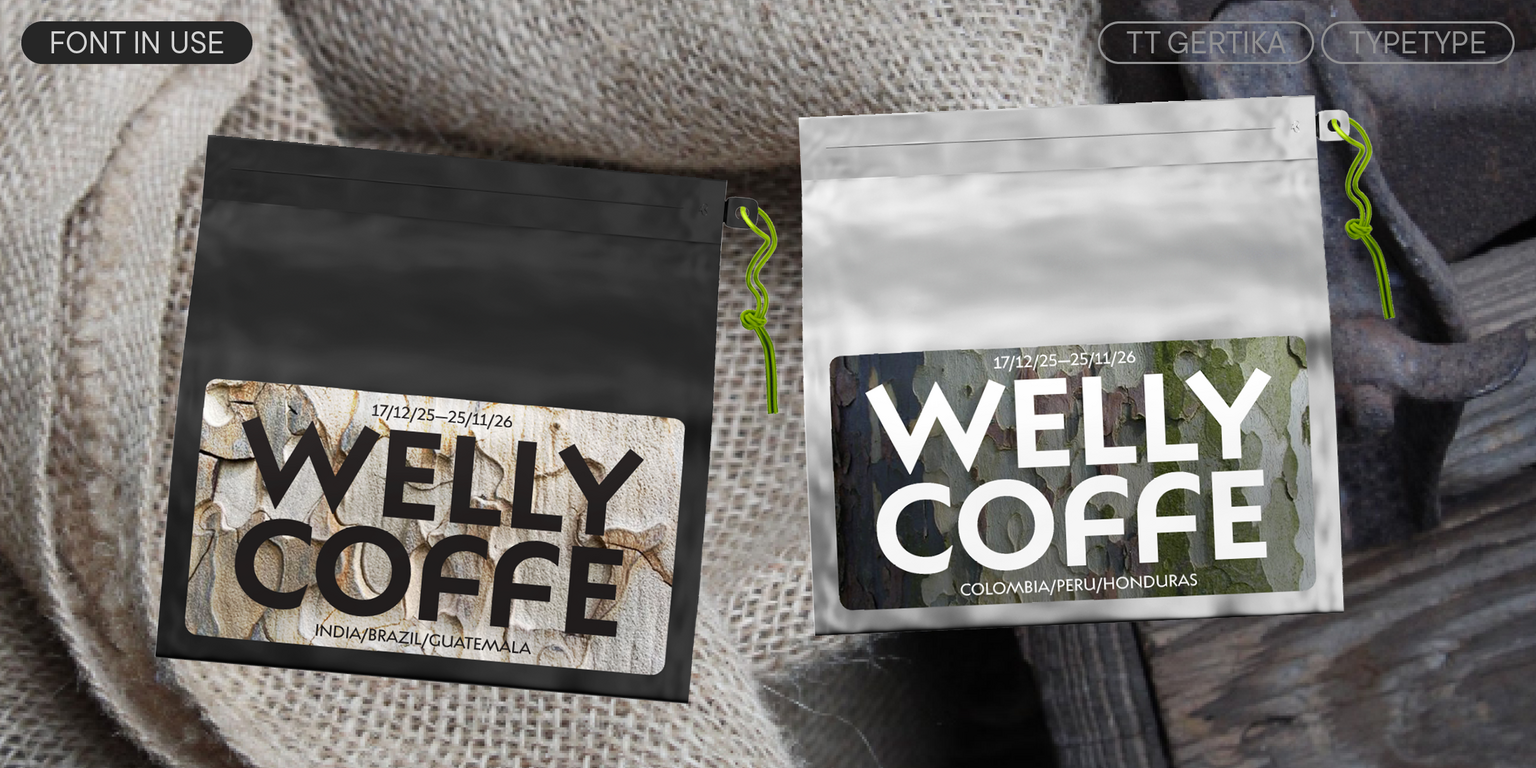
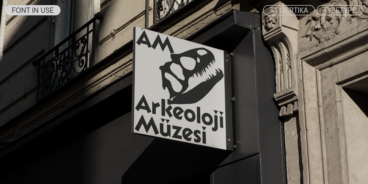
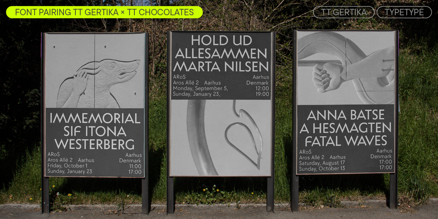
TT Gertika is well-suited for accent placement and shines best in large point sizes. However, it works well enough in small text blocks as well. This font is an excellent choice for covers of books and magazines dedicated to art. It can effortlessly adorn the exhibition environment and blend harmoniously with brand identities inspired by folklore and works from the primitivist genre.

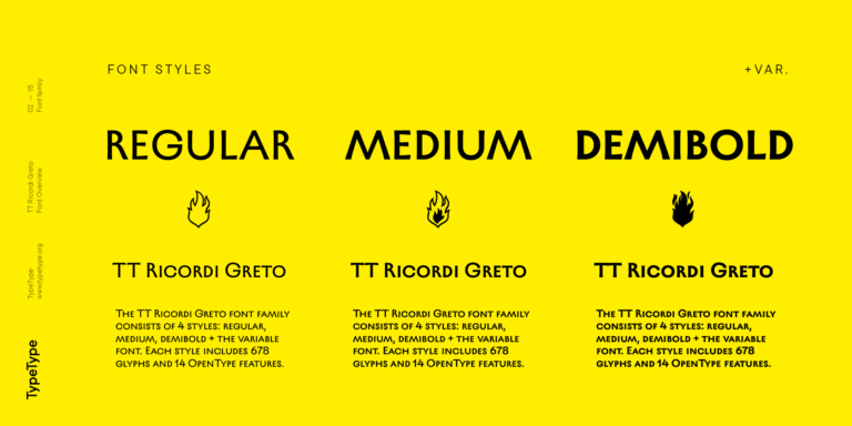
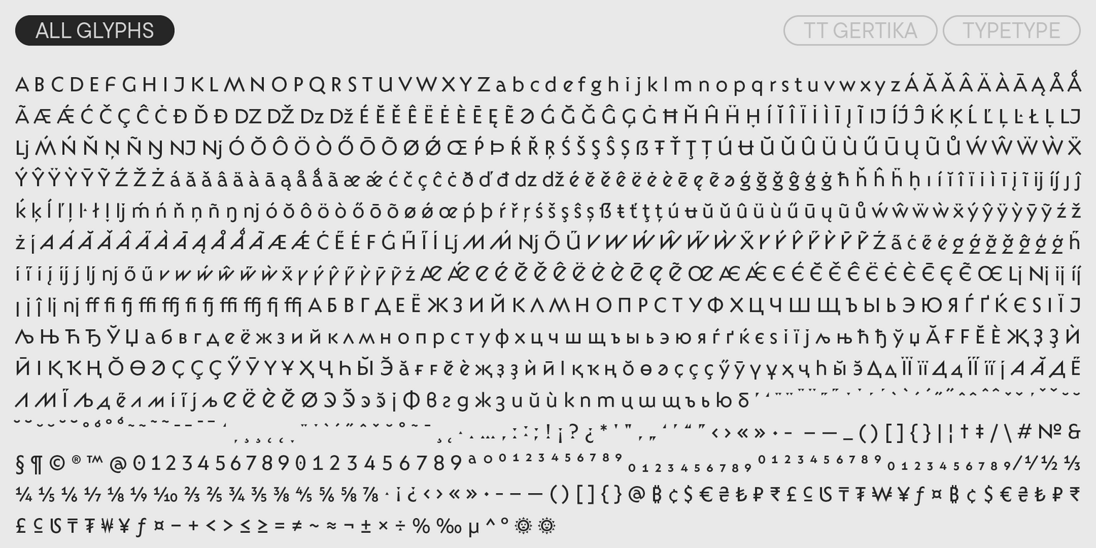
TT Gertika includes:

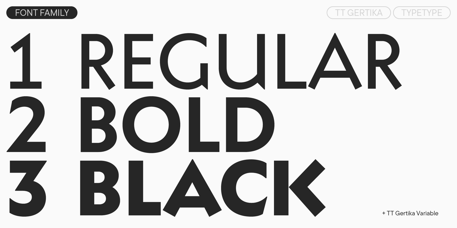
  • 4 font styles: 3 roman and one variable font;
  • 922 characters in each font style;
  • 4 stylistic sets;
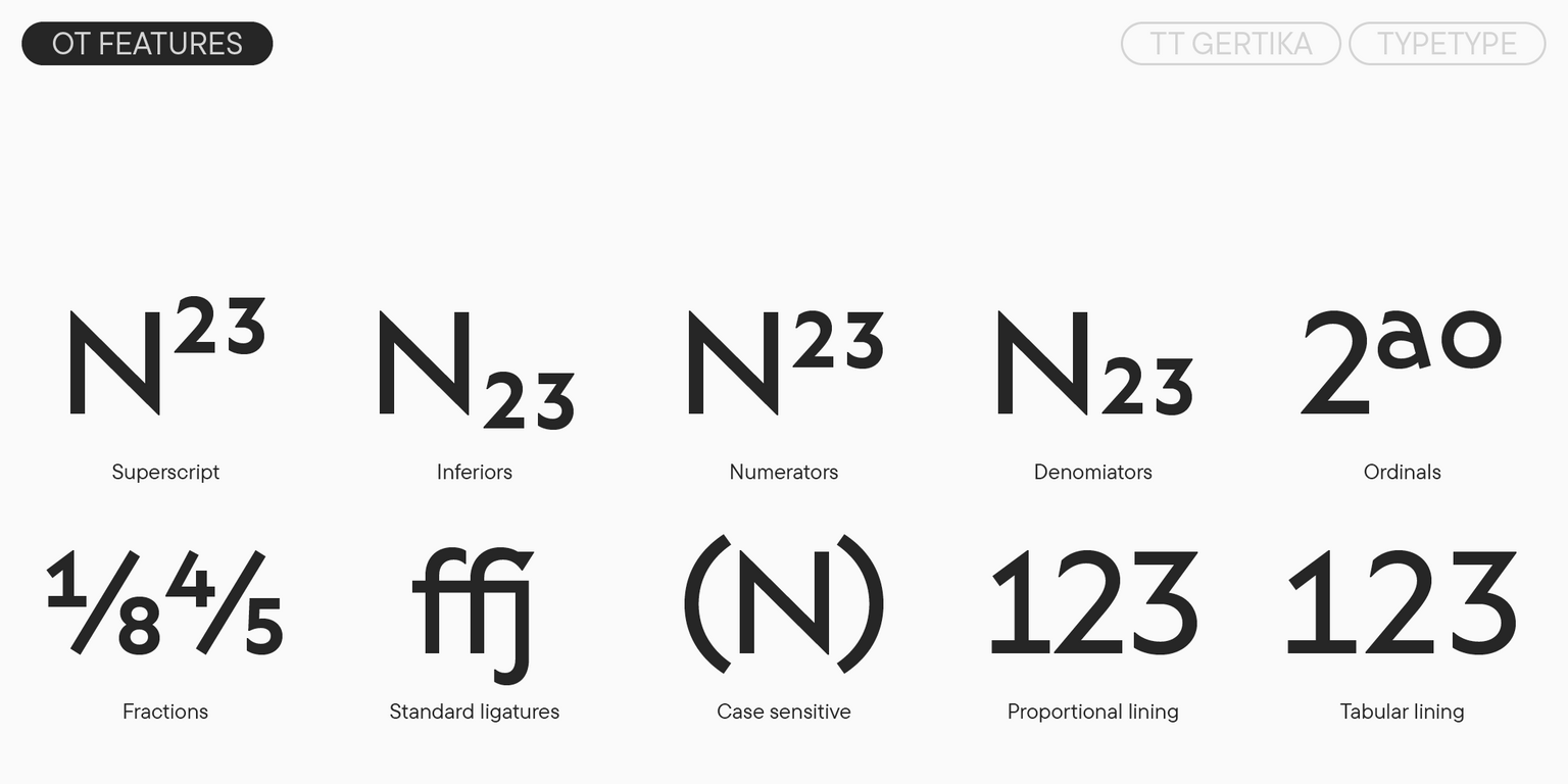
  • 28 OpenType features;
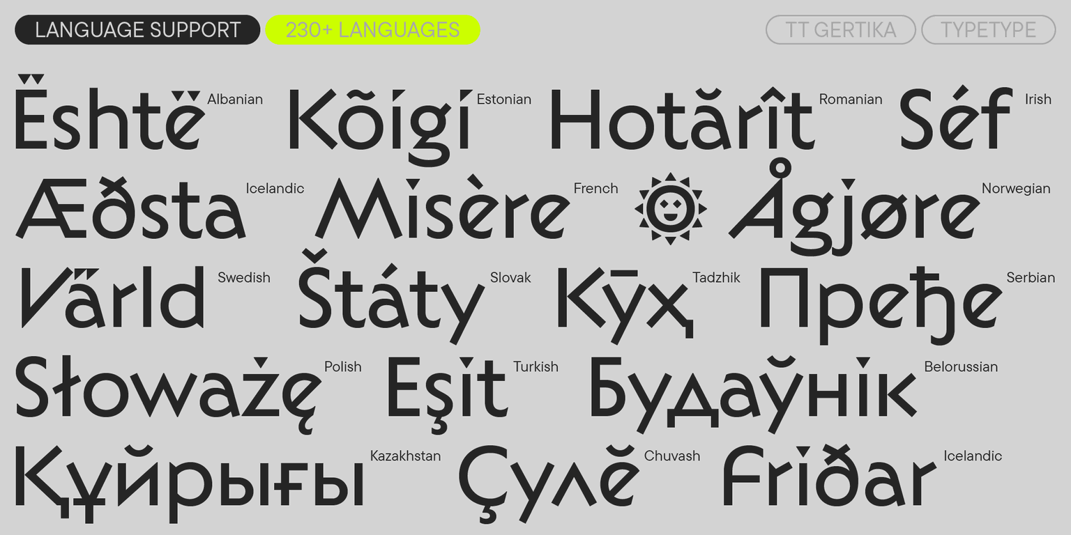
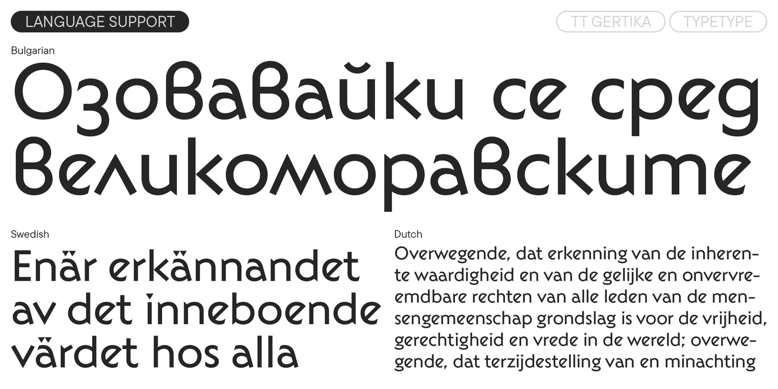
  • 230+ supported languages.

240+ دعم اللغات

نظام الكتابة المتد + عرض الكل

الفريق

Antonina Zhulkova — head of the project, design lead
Anastasia Pogorelova — idea author, senior type designer
Yuriy Nakonechnyi — mastering
Stanislav Tikhonov — mastering, hinting
Elizabeth Ostrovskaya — supervision kerning
Ivan Gladkikh — kerning

تاريخ الإصدار

نوفمبر 12, 2024

إضافي

عينة

تنزيل عينة الخط (PDF)

الرسومات الإعلانية

العرض التقديمي على Behance

إصدارات مخصصة

هل تبحث عن إصدار مخصص من هذا الخط؟

240+ دعم اللغات

نظام الكتابة المتد +
TT Gertika
الحجم
Otf
تشغيل الكل

TT Gertika is a geometric sans serif with a distinctive dynamic and a dancing rhythm

TT Gertika
الحجم
Otf
تشغيل الكل

In its visual style, TT Gertika blends modern elements and a touch of primal. The font boasts unique characteristics, such as dynamic proportions, asymmetrical sharp terminals in glyphs like “S”, “C”, and “З” and 90-degree cuts on the horizontal strokes. We also designed various diacritical marks for wide and narrow letter- forms. When using stylistic sets, you can adjust the mood and the look of the font by making it sharper and more dynamic or the opposite, rounded and fluid.

TT Gertika
الحجم
Otf
تشغيل الكل
متغير
Weight

The fonts family consists of 4 font styles: 3 roman and one variable font

ميزات OpenType

liga | Standard Ligatures

ff fi

ff fi

ss01 | Alternative angles

A M

A M

ss02 | Tilted letters

ǼÉ

ǼÉ

ss03 | Alternative Latin E

ǼÉ

ǼÉ

ss04 | Straight j

íj ij

íj ij

ss10 | Chuvash localization

Ҫ ҫ

Ҫ ҫ

dlig | Discretionary Ligatures

1/2 1/3

1/2 1/3

numr | Numerator

H123

H123

عرض الكل

الأزواج المثالية للخطوط مع TT Gertika.

What is a font pair, and what does it serve for?

A font pair is a combination of two fonts within one text block. Most often, one of the fonts in a pair is a more expressive headline font, and the other one serves to communicate information. Such fonts complement each other and help designers solve various tasks, like highlighting key elements, adding emotional expressiveness to the project, or separating semantic blocks.

How to choose fonts for a project: Several general recommendations

To begin with, establish the project’s tone. Choose the fonts that stylistically match the main idea. After that, you need to determine the functions of each font in the project and their hierarchy: which font will complement the design and which one will serve to attract attention as the main element. You need to assess the difference between the fonts and decide what kind of information each of them should convey. First, we recommend choosing the base font you will use most, and then you can find a suitable pair for it.

Core principles of font pairing and recommendations from designers

The main rule you should follow when matching two fonts is that both similarities and differences must be visible between them. You can highlight the coherence of fonts by the following characteristics: contrast, proportions, width, openness of characters, individual letter shapes, and overall tone. Feel free to experiment with different combinations. We also recommend analyzing the projects you like: this way, you can enhance your visual skills, elevate your knowledge base, and gain confidence in dealing with typography.

خطوط مشابهة

اختر الخطوط والتراخيص التي تريدها