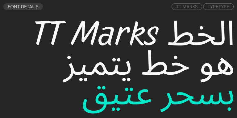
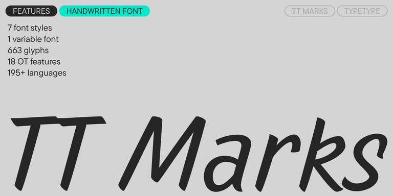
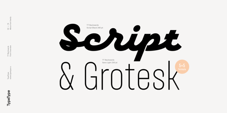
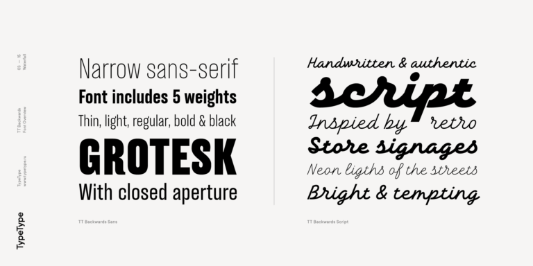
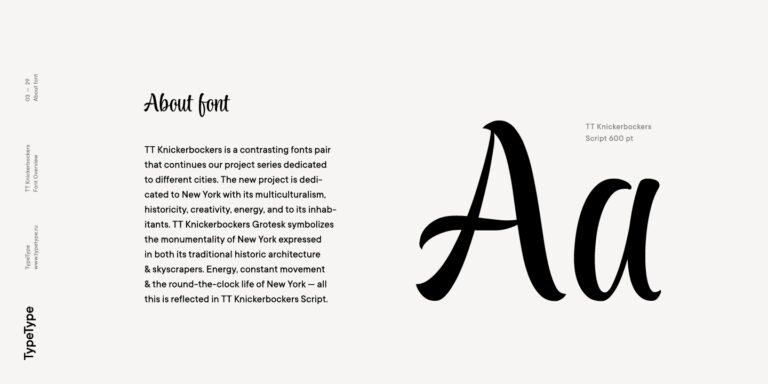
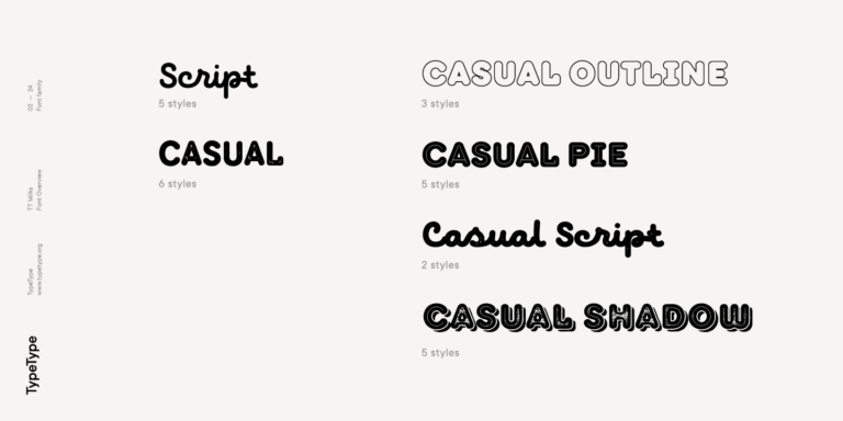
TT Marks delivers a script with dynamic rhythm, heartfelt character, and nostalgic appeal inspired by the classic art of American sign painting. This craft, where skilled artists hand-painted storefront signage with brushes and careful technique, is experiencing a well-deserved renaissance in today’s design world.
خطوط مشابهة لـ Lobster Fugu
- جميع الخطوط 73
- بدون الذنابات 47
- مع الذنابات 27
- سلاب 6
- العرض 41
- مكتوبة بخط اليد 10
- متغيرة 47
- بيع الخطوط 11
إذا كنت قد سئمت من الخطوط الشائعة الاستخدام وتبحث عن خطوط مشابهة لـ Lobster Fugu، فاطلع على أفضل البدائل المجانية للتجربة التي تقدمها Lobster Fugu، والتي تتميز بخصائص مشابهة بالإضافة إلى تصميمات جديدة وفريدة من نوعها. تنتمي بعض هذه الخطوط إلى نفس الفئة، بينما يُمكن أن تكون الأخرى مناسبة لنفس المهام أو تحمل سمات مشابهة، ولكنها تتميز بتفاصيل أو نسب مميزة.
في TypeType، ستجد خطوطًا مبتكرة مثل Lobster Fugu بل وأفضل: إليك بعض البدائل الرائعة وغير الشائعة لخط Lobster Fugu. استخدم هذه القائمة لأعلى الخطوط جودة التي تشبه Lobster Fugu كما تريد. تقدم قائمتنا مجموعة واسعة من الخيارات لاختيار أفضل خط يناسب مشروعك ويضفي لمسة منعشة على تصميماتك. جميع الخطوط الموجودة في هذه المجموعة متوفرة بأشكال متعددة وبأسعار معقولة، لتتمكن من العثور على ما يناسب احتياجاتك بالكامل!
ابحث عن بديل رائع لخط Lobster Fugu وحاول إعادة خلق نفس الحالة المزاجية والتأثير الذي تسعى لتحقيقه باستخدامه في تصميماتك. كل خط معروض في هذه الصفحة هو بمثابة نسخة مشابهة لخط Lobster Fugu، يكاد يكون مطابقًا له.
- The quick brown fox jumps over a lazy dog.
- Pack my box with five dozen liquor jugs.
- Sphinx of black quartz, judge my vow
- 0123456789 !?.,:;—–()[]{}<> “quotes” ‘apostrophe’ @#%&*_+=/\| № $ € £ ₽ +−×÷=≠≤≥ … % © ® ™
- Aa Bb Cc Dd Ee Ff Gg Hh Ii Jj Kk Ll Mm Nn Oo Pp Qq Rr Ss Tt Uu Vv Ww Xx Yy Zz
TT Gertika is a geometric sans serif with a dynamic character and a dancing rhythm. This font’s idea originates from the lettering featured on an American poster from the late 1930s.
TT Biersal is a display sans serif with a free-spirited, playful, and adventurous nature. The concept of this font was sparked by a German poster from the early 1930s.
TT Rounds Neue soft, friendly, rounded sans serif fontfamily
The starting point of the TT Trailers project was the idea to develop a new generation of narrow typefaces for use in movie credits and posters.
TT Nooks is an experimental project comprised of a high-contrast egocentric serif and an upright humanist italic.
TT Backwards Sans is a narrow grotesque, which takes us back to the book design of late 70s and early 80s with its ductile characters.
TT Knickerbockers Grotesk is a narrow contrast sans serif with characteristic elements sending us back to the 19th century in New York.
TT Polls is the modern modular slab serif family for using in sports-related design.
TT Berlinerins is a grotesque inspired by the wood-type poster types of the first third of the 20th century is responsible for the historic component of Berlin.
TT Milks is a Collection of typefaces for branding
TT Hazelnuts is a display sans serif font family containing a set of elegant and delicate decorative elements.
The quick brown fox jumps over a lazy dog.
TT Corals is a modern humanistic sans serif which has many typical traits of the beginning of the 20th century. For an increased functionality of the font family, we’ve created 6 styles of various weights.
