TT Livret
Text Regular
32 أنماط خط
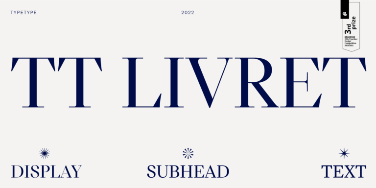
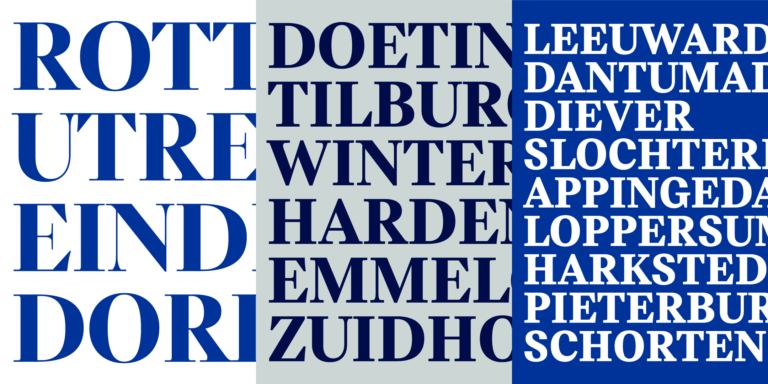
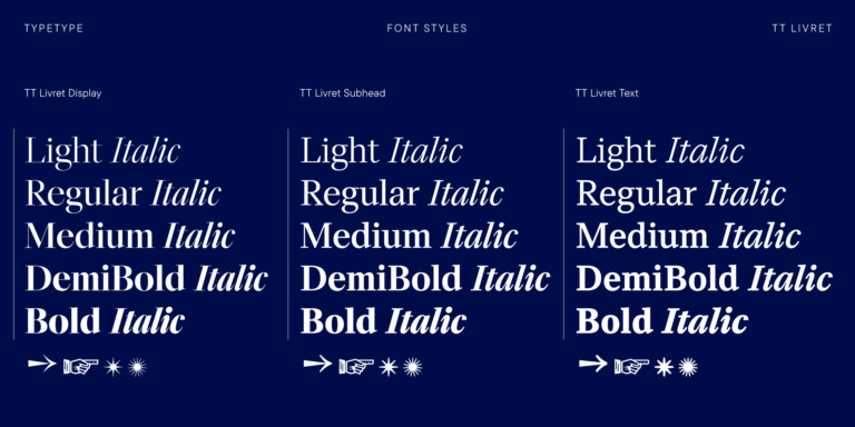
TT Livret is an elegant, modern and functional serif

إذا كنت قد سئمت من الخطوط الشائعة الاستخدام وتبحث عن خطوط مشابهة لـ Bookman JF Pro، فاطلع على أفضل البدائل المجانية للتجربة التي تقدمها Bookman JF Pro، والتي تتميز بخصائص مشابهة بالإضافة إلى تصميمات جديدة وفريدة من نوعها. تنتمي بعض هذه الخطوط إلى نفس الفئة، بينما يُمكن أن تكون الأخرى مناسبة لنفس المهام أو تحمل سمات مشابهة، ولكنها تتميز بتفاصيل أو نسب مميزة.
في TypeType، ستجد خطوطًا مبتكرة مثل Bookman JF Pro بل وأفضل: إليك بعض البدائل الرائعة وغير الشائعة لخط Bookman JF Pro. استخدم هذه القائمة لأعلى الخطوط جودة التي تشبه Bookman JF Pro كما تريد. تقدم قائمتنا مجموعة واسعة من الخيارات لاختيار أفضل خط يناسب مشروعك ويضفي لمسة منعشة على تصميماتك. جميع الخطوط الموجودة في هذه المجموعة متوفرة بأشكال متعددة وبأسعار معقولة، لتتمكن من العثور على ما يناسب احتياجاتك بالكامل!
ابحث عن بديل رائع لخط Bookman JF Pro وحاول إعادة خلق نفس الحالة المزاجية والتأثير الذي تسعى لتحقيقه باستخدامه في تصميماتك. كل خط معروض في هذه الصفحة هو بمثابة نسخة مشابهة لخط Bookman JF Pro، يكاد يكون مطابقًا له.
TT Livret is an elegant, modern and functional serif
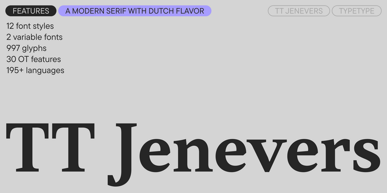
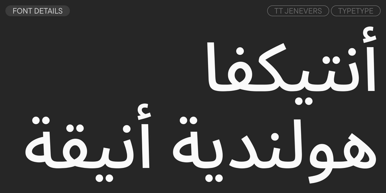
TT Jenevers is a modern serif with a Dutch flavor. The font family features the characteristic details peculiar to Dutch serifs—these are the asymmetrical shape of serifs and an irregular slant of ovals.
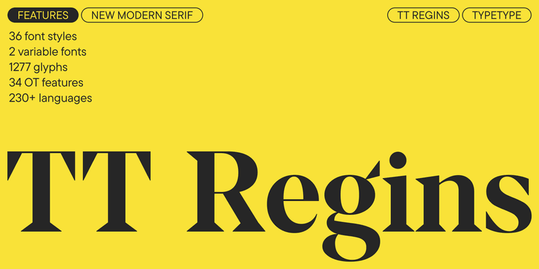
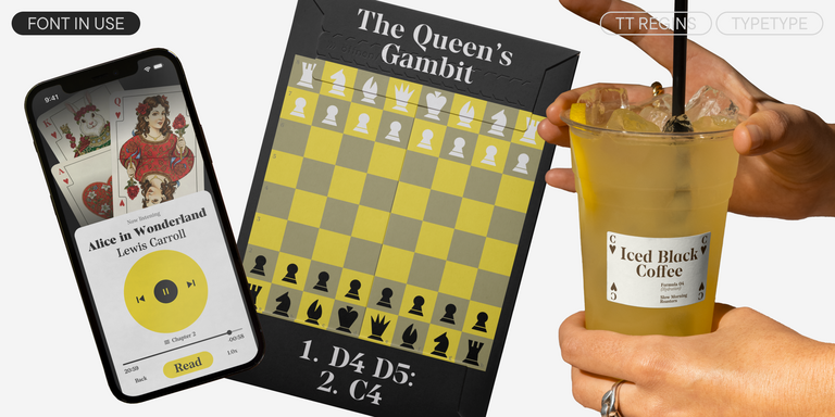
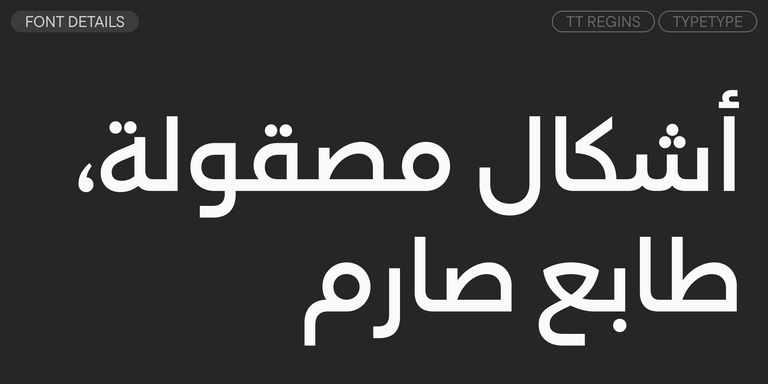
TT Regins is a Scottish modern serif. Striking contrast and sharp triangular serifs give this font a stern and commanding character, while refined forms, enlarged lowercase letters, and slightly condensed, static proportions add grace to its design.
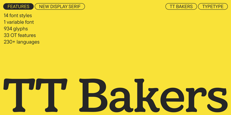

TT Bakers is a fluid serif with a gentle and lively character. This font is like freshly baked goods: it’s warm and soft, especially in its bolder weights.
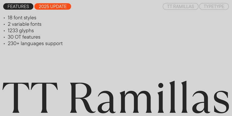
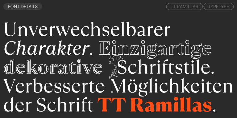
TT Ramillas is a fully reconsidered high contrast transitional serif, which is perfectly adapted to modern realities and requirements.
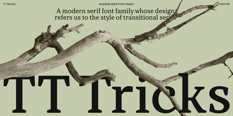
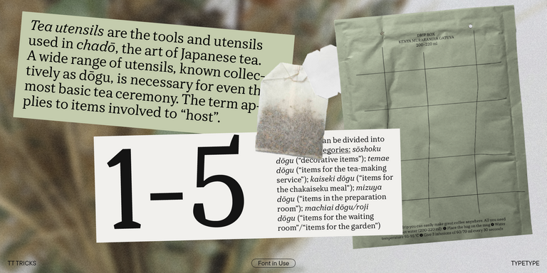
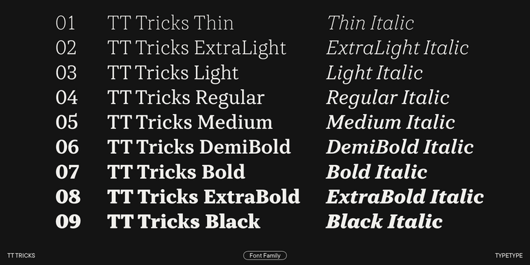
TT Tricks is a modern text serif with a design reflecting the style of Transitional serifs. This font has a calm, elegant, and moderately stern character.

TT Geekette is an experimental variable serif with friendly and flexible character of shapes.

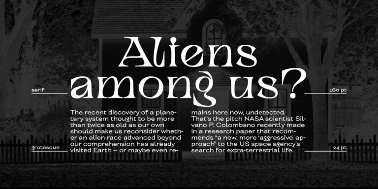
TT Alientz is a variable typeface that allows the user to make a visual journey from an extraterrestrial grotesque to a very prickly display serif.

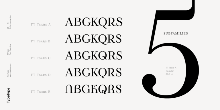
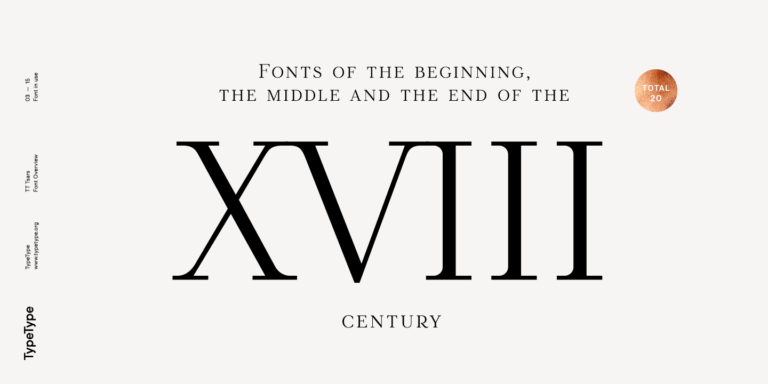
The TT Tsars font family is a collection of serif display fonts that are stylized to resemble the fonts of the beginning, the middle, and the end of the XVIII century.
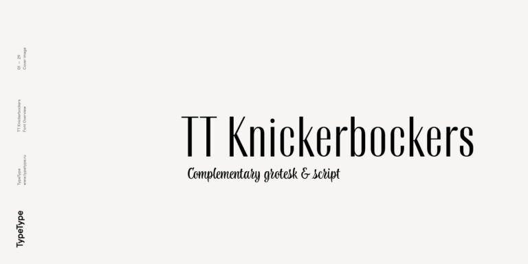
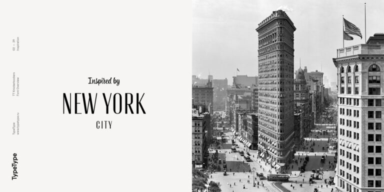
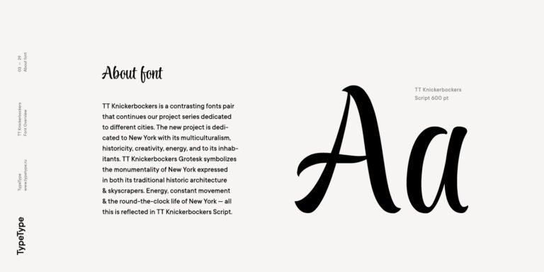
TT Knickerbockers Grotesk is a narrow contrast sans serif with characteristic elements sending us back to the 19th century in New York.
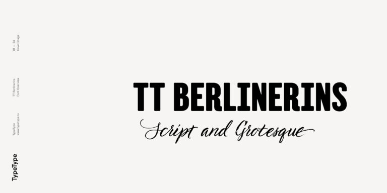
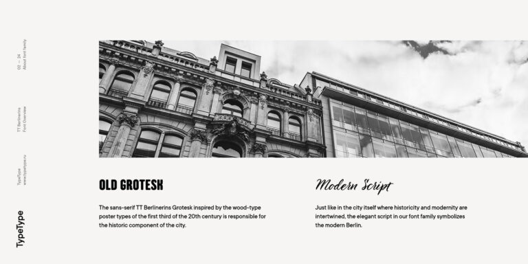
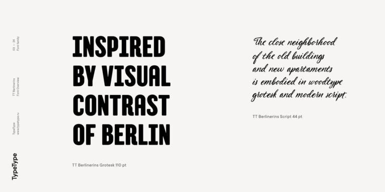
TT Berlinerins is a grotesque inspired by the wood-type poster types of the first third of the 20th century is responsible for the historic component of Berlin.
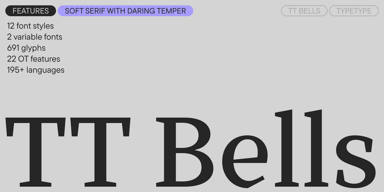

TT Bells combines the elegant softness of Antiqua with a complex and daring temper reflected in straight stroke terminals and arrowheaded serifs. The typeface is based on the broad nib, which creates these hallmark terminals and serifs.

The quick brown fox jumps over a lazy dog.