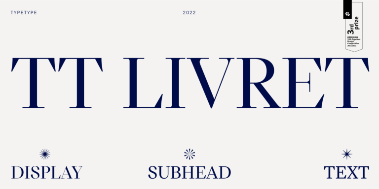
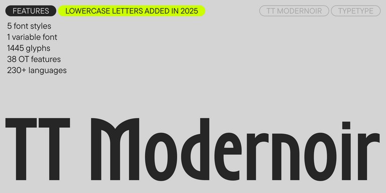
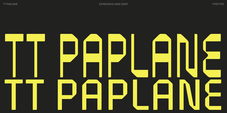
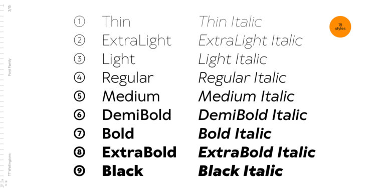
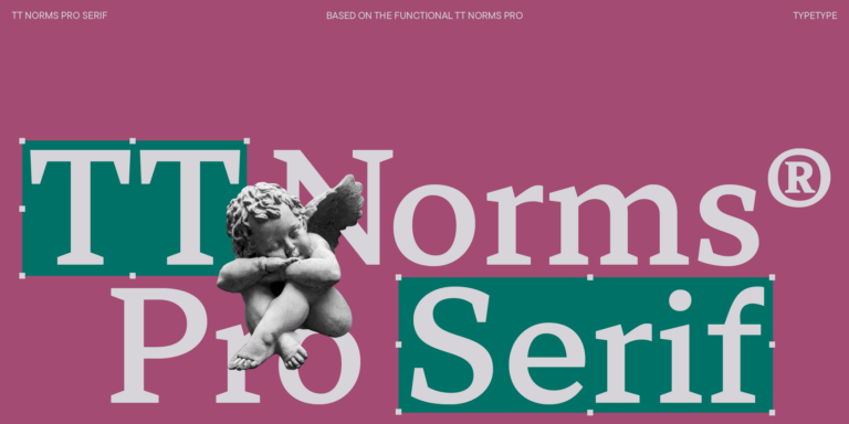
TT Norms® Pro Serif
Regular
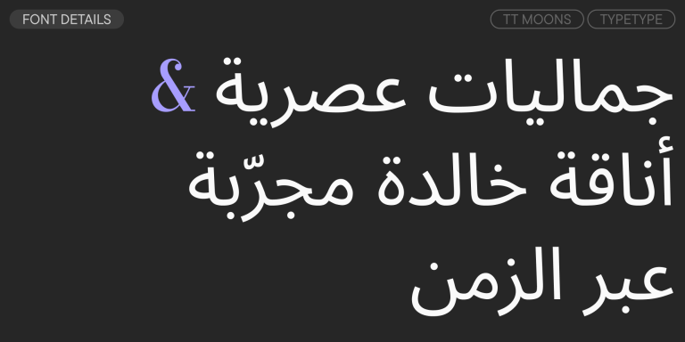
24 أنماط خط
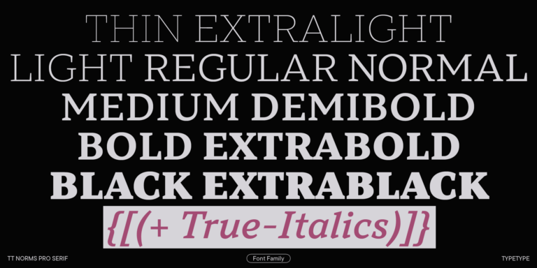
We continue to expand the line of the studio's main bestseller TT Norms® Pro!