TT Livret
Text Regular
32 أنماط خط
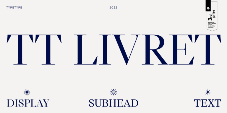
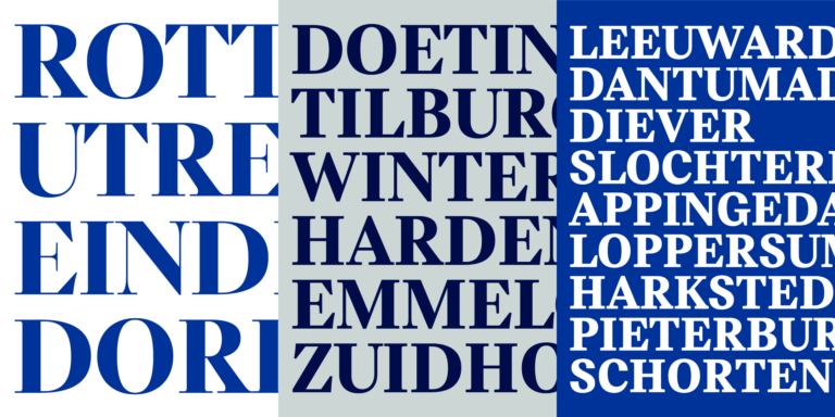
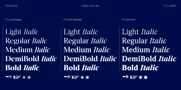
TT Livret is an elegant, modern and functional serif

إذا كنت قد سئمت من الخطوط الشائعة الاستخدام وتبحث عن خطوط مشابهة لـ Larken، فاطلع على أفضل البدائل المجانية للتجربة التي تقدمها Larken، والتي تتميز بخصائص مشابهة بالإضافة إلى تصميمات جديدة وفريدة من نوعها. تنتمي بعض هذه الخطوط إلى نفس الفئة، بينما يُمكن أن تكون الأخرى مناسبة لنفس المهام أو تحمل سمات مشابهة، ولكنها تتميز بتفاصيل أو نسب مميزة.
في TypeType، ستجد خطوطًا مبتكرة مثل Larken بل وأفضل: إليك بعض البدائل الرائعة وغير الشائعة لخط Larken. استخدم هذه القائمة لأعلى الخطوط جودة التي تشبه Larken كما تريد. تقدم قائمتنا مجموعة واسعة من الخيارات لاختيار أفضل خط يناسب مشروعك ويضفي لمسة منعشة على تصميماتك. جميع الخطوط الموجودة في هذه المجموعة متوفرة بأشكال متعددة وبأسعار معقولة، لتتمكن من العثور على ما يناسب احتياجاتك بالكامل!
ابحث عن بديل رائع لخط Larken وحاول إعادة خلق نفس الحالة المزاجية والتأثير الذي تسعى لتحقيقه باستخدامه في تصميماتك. كل خط معروض في هذه الصفحة هو بمثابة نسخة مشابهة لخط Larken، يكاد يكون مطابقًا له.
TT Livret is an elegant, modern and functional serif
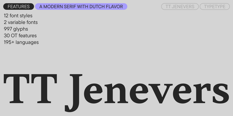
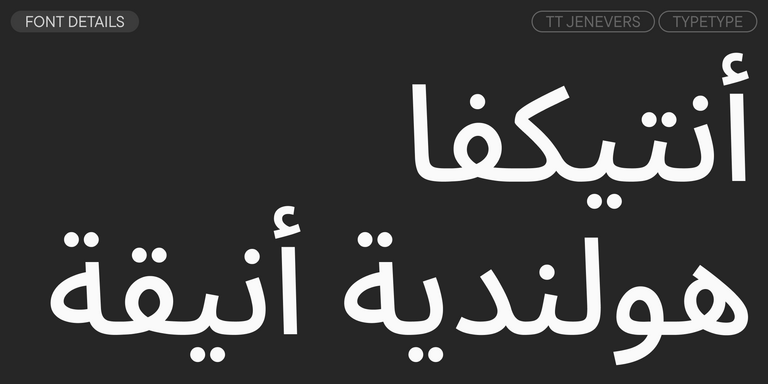
TT Jenevers is a modern serif with a Dutch flavor. The font family features the characteristic details peculiar to Dutch serifs—these are the asymmetrical shape of serifs and an irregular slant of ovals.
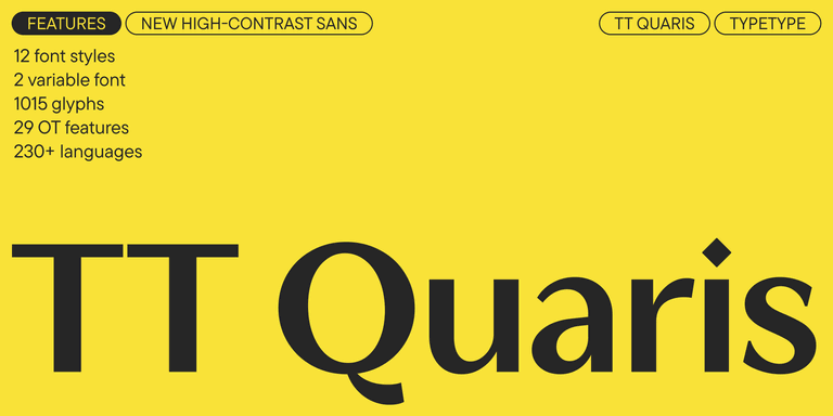
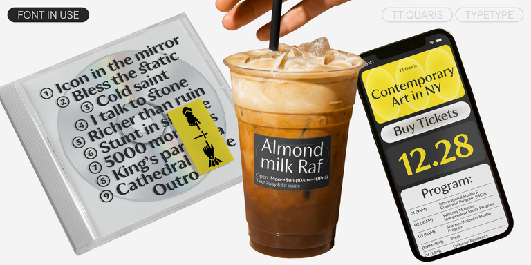
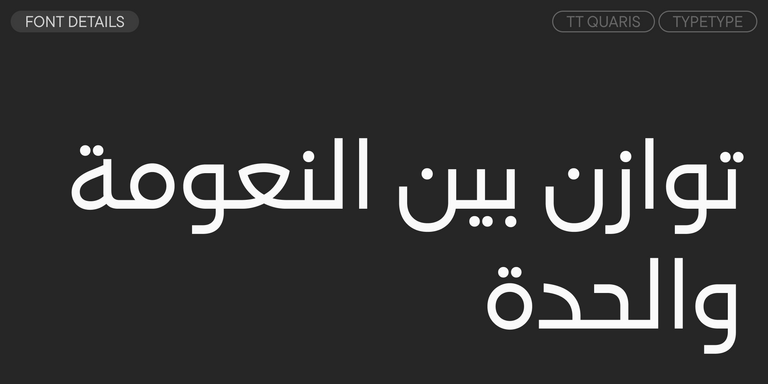
TT Quaris is an exquisite, modern high-contrast sans whose design balances between soft and sharp. The glyph shapes in the font are fluid and tend towards roundness, yet there are also sharp elements.
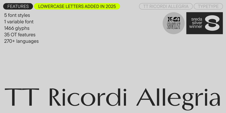

TT Ricordi Allegria is a sleek and intelligent contemporary Florentine grotesque.
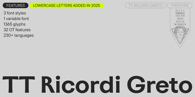
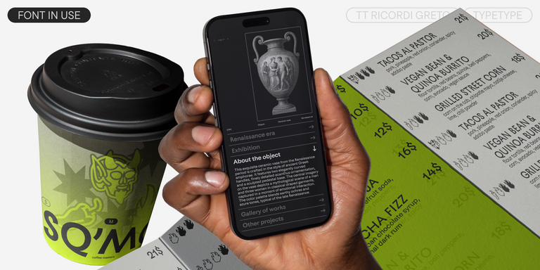
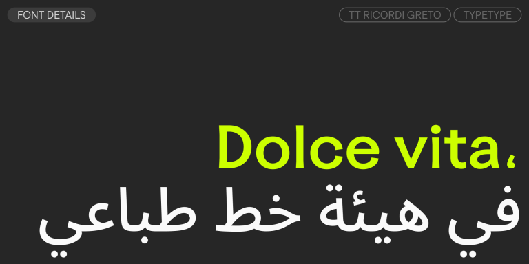
TT Ricordi Greto is an experimental project, inspired by a floor plaque dating from 1423 found in the Basilica di Santa Croce, Florence.
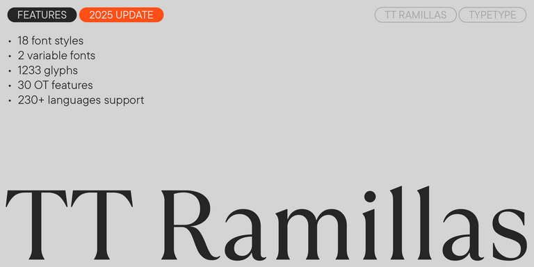
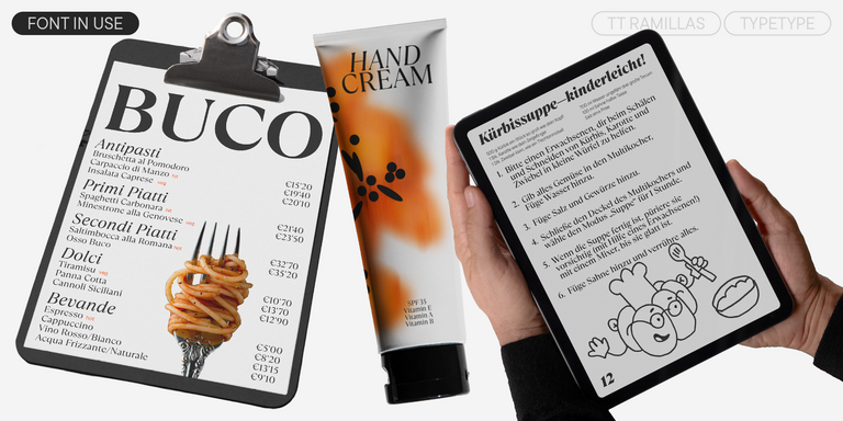
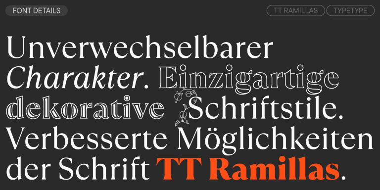
TT Ramillas is a fully reconsidered high contrast transitional serif, which is perfectly adapted to modern realities and requirements.
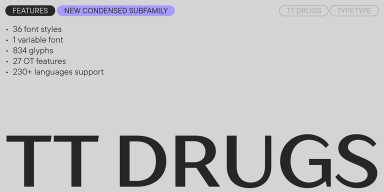
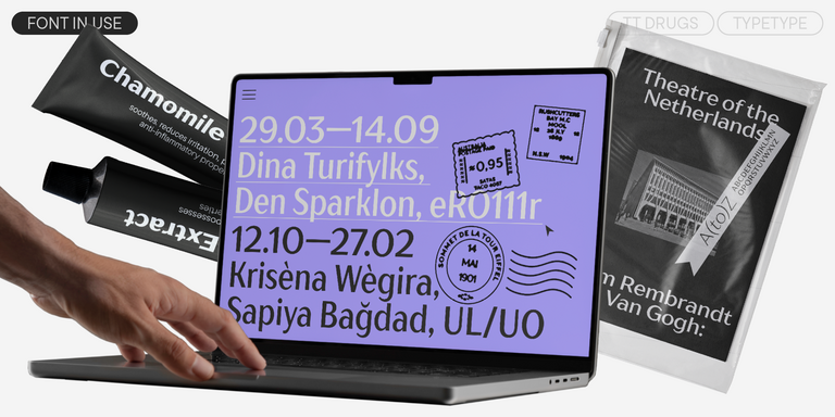
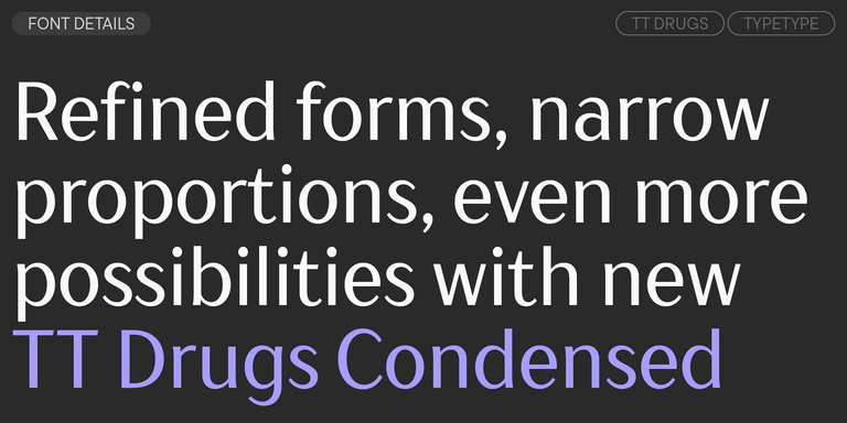
TT Drugs is a typeface that doesn’t feature serifs but stands out for its high contrast.
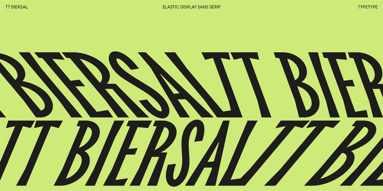
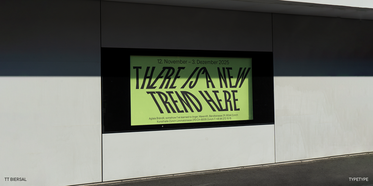
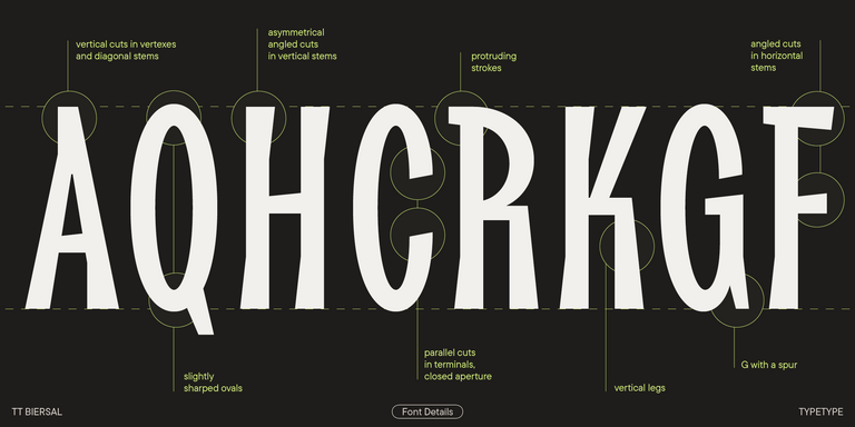
TT Biersal is a display sans serif with a free-spirited, playful, and adventurous nature. The concept of this font was sparked by a German poster from the early 1930s.
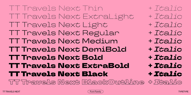
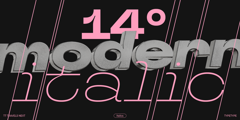
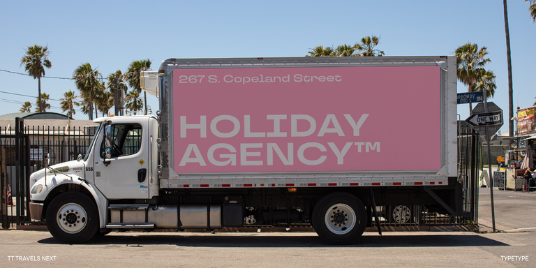
TT Travels Next is a very trendy and modern wide display sans serif for use in different sets, be they print or web.
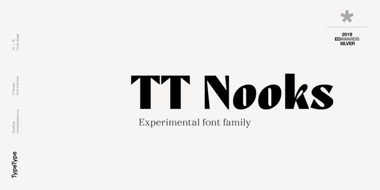
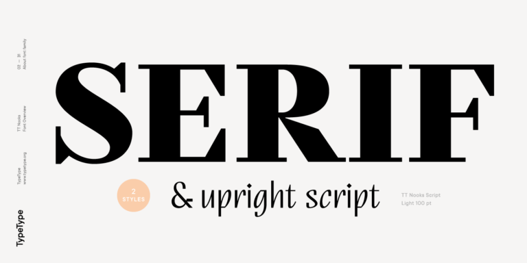
TT Nooks is an experimental project comprised of a high-contrast egocentric serif and an upright humanist italic.
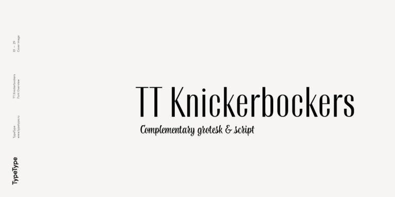
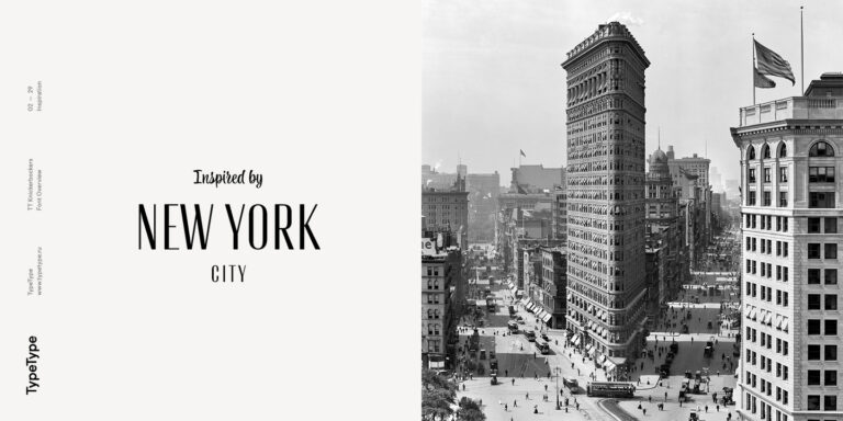
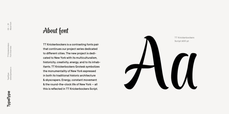
TT Knickerbockers Grotesk is a narrow contrast sans serif with characteristic elements sending us back to the 19th century in New York.