Today we will share a fascinating story of creating a font family to set logos for one of the largest brands. We promise you won’t be bored: in this story, you will have the chance to have a look at all stages of the work and will learn more about font creation.
Main characters:
• TypeType font design studio. Creators of over 50 font families, including the popular TT Commons™ Pro и TT Norms Pro®. TypeType has project collaborations all over the world, customizes existing fonts and creates new ones.
• Mail.ru Group brand team. One of the largest and most well-known IT companies. The brand ecosystem includes VKontakte and Odnoklassniki social media, Warface, Crossfire and Armored Warfare online games, food delivery services, mail services and messengers.
Prologue
Sometimes, a company gets a project that makes it rethink the usual work processes, poses a professional challenge and teaches an important lesson, resulting in useful experience and nice memories.
It all started in August 2018. Mail.ru Group contacted us. At that point, the company was already going through the final stages of a large-scale rebranding process. They have already shown their new corporate style, enhanced concept and further planned changes to the audience, and they needed to polish up the fonts for logos of internal services. The Mail.ru Group designer team had prepared a concept of the desired character of the font family, and they initially contacted us to receive a competent review and have the font prepared technically. The task seemed easy.
Skipping ahead, the project has taken a year, during which the letters initially proposed by Mail.ru Group underwent significant changes and finally became a final touch in the brand’s new corporate style.
Part one. The beginning.
We had typographic experience and a trained eye of the professional team dealing with any types of fonts. Mail.ru Group had the logos that they wanted to transform into a convenient font. More importantly, this had to be a font for setting logos as it had to be a scalable solution suitable for different name projects.
«We have been thinking about our own font family for a while, since 2014. The full-scale rebranding work catalyzed this idea. We conducted an in-depth investigation on logo redesign in our field, which showed that stable trend in going from artsy and bright fonts to neutral, light sans-serifs. Lightness and clarity of such fonts seemed to us convenient to work with, as this type of fonts has good readability in different sizes and does not attract much attention to itself.»
Evgeny Dolgov, lead designer of the Mail.ru Group brand team
Our best minds and eyes grabbed the provided letters and started to remake them changing what was wrong from the typographic standpoint, making each letter expressive and creating a readable harmonious font from what we got to work with.
Mail.ru Group appreciated our eagerness, but there was a large but lurking. They thought of the font as the extension of their concept and the font’s logo-like properties had special meaning to them. Mail.ru Group saw their font as a single piece, monolithic and geometric.
Working with logo typeface on this scale was a new experience for us. We tried to find a balance between the wishes of the customer and our vision, but professional meticulousness to details and adherence to the rules of typography sometimes prevailed.
Nevertheless, during this period there were many changes that were developed in subsequent stages.
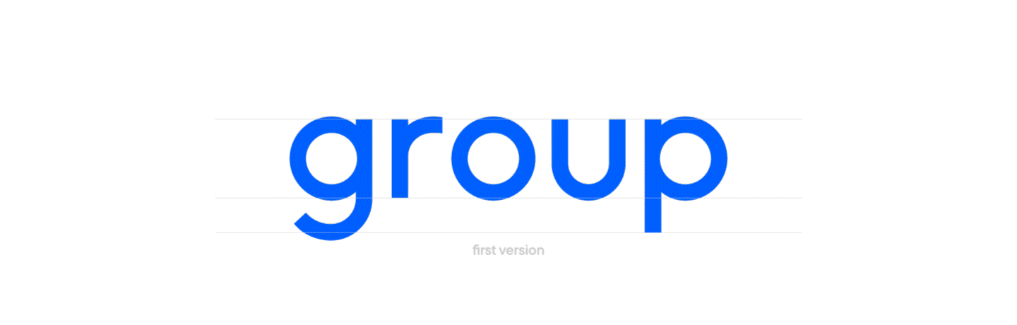
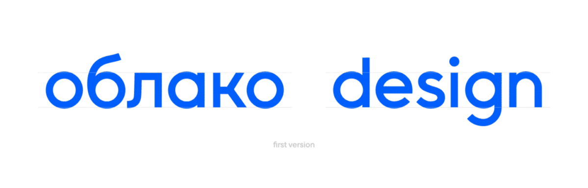
• Initially, we made visual «inflows-compensators» in the paradigm of the standard approach, but during the discussions we made them smaller. The oval has become visually rounder and the font became more geometric.
• We changed the length of ascenders and descenders so that the font would look more monolithic.
• We experimented with the height of descenders in the letters j and g and the incline of diagonals in the letters к, k, л.
• A number of changes was made to the letter proportions to make the font look whole.
«We wanted to avoid the heaviness of bold and dark types in the font, especially considering the fact that mail.ru has projects with different word lengths in the names. While the short names looked good in bold, the long ones didn’t look their best, especially close to the light font in the project menu. In the end, we settled on the Medium face. Also, experimenting with the anatomy of letters, we decided to reduce the ascenders and descenders of some characters (such as h t l g j b d), which ultimately allowed us to get sturdier and stabler logos.»
Evgeny Dolgov, lead designer of the Mail.ru Group brand team
We discussed, tried and searched a lot. We changed separate faces and meticulously worked on letter details. We found points of contact but we could not grasp the full vision.
This entire period was devoted to the search for mutual understanding. With small but numerous changes, each of the participants built a path to the concept that was difficult to formulate at that particular stage, but which, although not yet understood by the process participants, was already waiting for us.
Part two. Meeting and restarting
The changes continued. The original plan was to take the original Russian and English alphabets of Mail.ru Group and correct them in the font file, completing the remaining letters and setting spacing and kerning. We needed to check the heights and widths of the characters, to make the letters in the set look solid, consistent and harmonious and to assemble the font so that the holding team could install them in systems and type logos as text. But already at the end of the initial stage, it became clear that the work goes much further beyond the primary plan.
We continued to edit the letters, partially redrew them, discussing changes and wishes.
«It’s not easy for designers and professional typographers to speak the same language. We, designers, perceive the logo as an element of graphic design in a holistic identity, and not as a set of well-defined rules that must be used when building fonts. Together with TypeType, we were looking for the line where the „logo is not equal to font“ approach still respects the laws of typography, but already looks like a graphic design element. »
Mitya Osadchuk, creative director of Mail.ru Group
In March 2019, we reached a tipping point. Despite many variations of the implemented changes, we lacked something to understand the whole picture. It was important for Mail.ru Group to see the monolithic concept of the typeface. We, accustomed to working with text fonts, applied the rules of typography to the new problem and carefully rewired our brains.
Written communication was not enough to outline the right direction due to all the factors, so we decided to meet. In personal communication, we began to reason again.
Having carefully studied all the previous processes, we proposed a new vision. Moreover, the involvement of one more TypeType employee in the project helped to develop a fresh perspective on the situation. Of course, we prepared for the meeting in advance, so a number of edits had already been proposed in the form of a presentation. In turn, the Mail.ru Group team spoke about their views, immersing us in their values. Integrity and graphicality, maximum geometry of signs, monolithic logo, absence of out-of-place elements and voids —— now we had a specific action plan and an understanding of what needs to be done to achieve a mutually approved result.
After the meeting, we could work more actively. Once again, we agreed on the edits and proceeded to take action.
• Working on the monolithic feel. Changing graphics.
• Testing different heights of ascenders and descenders.
• Finding a suitable shape for rounded letters. Working with compensators.
At the end of this stage, we firmly believed we were moving in the right direction, but one moment was still missing to reach the perfect idyll in the work. However, we did not know that the next discovery was already waiting for us.
Part three. It all started with the terminal.
Many changes had been made. The understanding had been worked out. Everything was going well, but something was missing before this could become the perfect font.
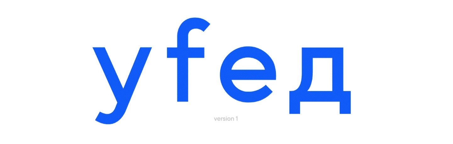
The jump start was the fonts provided by Mail.ru Group as references. We immediately grasped what exactly might have attracted them. So, redrawing of some characters began.
• We changed the shape of the terminals. In the original version from the company’s designers, they were rounded and protruding. The terminals now became straight and short.
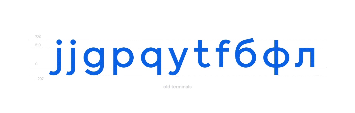
It was a real breakthrough! In fact, this turned out to be enough for the font to acquire the desired solidity, to become a solid piece. The ascender and descender lines laned at the same level, the perception of the font has changed in the right direction.
The Mail.ru Group were very pleased, and us even more so.
After that, we made many more changes, but it was the terminals that proved to be the key to achieving complete mutual understanding.
What happened next?
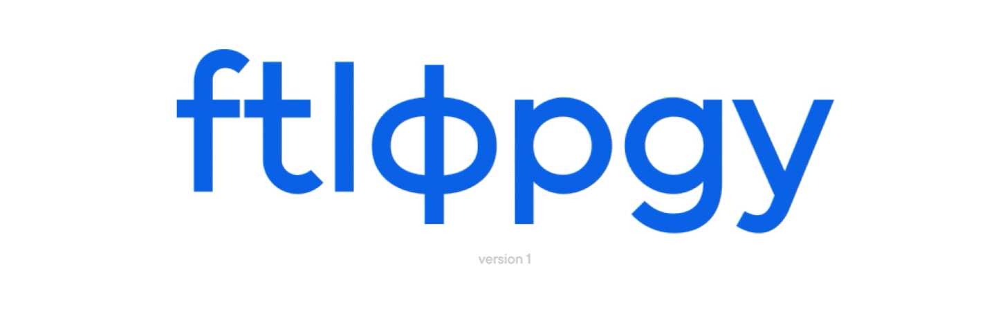
• We completely redrew the terminals and started converting the font to the same look.
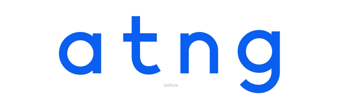
• Initially, g and p had different lengths. We usually do not allow this in fonts, but at the end of long edits in the previous stages, we were able to find the letterforms with which they look harmonious at the same length.• If we talk about the changes that are almost impossible in text fonts, but turned out to be part of creating solidity in the logo, these are the letters h and t. For t, the ascender is, as a rule, always smaller than for h. In the font for Mail.ru Group, we drew terminals of the same height.
• Another feature of the font for the holding’s logos is the letters б or g. In a text font, we would raise the oval above the baseline of the letter g, and in б, we would not bring the oval to the level of lowercase characters. It was a difficult moment, since we wanted to make the oval smaller, because there is not enough space for the full size, especially with short ascenders and descenders. We meticulously worked with the shape of the terminal in g and the shape of the flame-shaped element in б to fit everything, but thanks to the final solution, the block and the integrity of the font were preserved.
The new version of the font began to look more modern and laconic, all while we reached harmony with the wishes of Mail.ru Group and were able to transfer their concept and vision to the font. The final steps remained.
«Our team managed to create the character and mood of the overall picture, which was important to bring all the way to the end. Obviously, there are dozens of typographic subtleties we could not have worked out on our own, because one small change in a couple of letters affects the entire font. In such a situation, trusting is the best thing that can be done for the final result »
Mitya Osadchuk, creative director of Mail.ru Group
Part four. Finish line.
We have already reached the agreed solidity, we were able to bring the font to a graphic, but at the same time laconic look. The terminals had changed, we had adjusted the thicknesses and widths. We redrew some letters, and after agreeing on the graphics, we began to expand the font character composition.
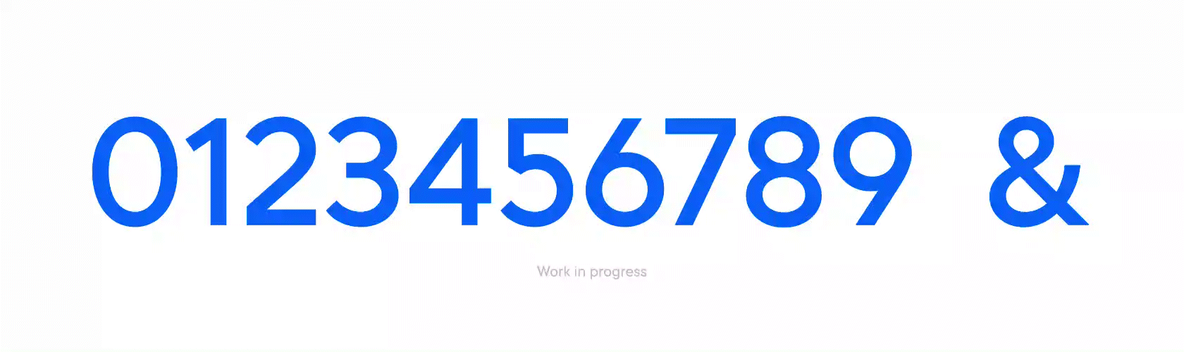
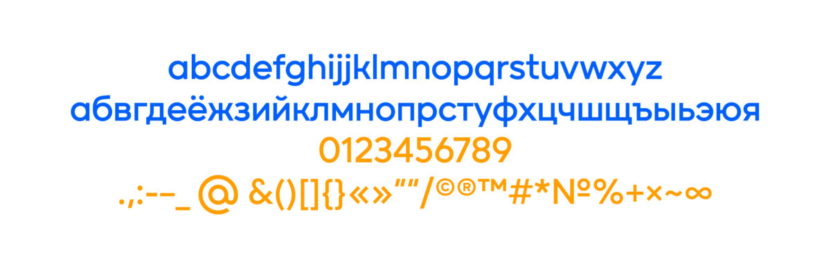
• Figures and punctuation marks were drawn from scratch, based on the available graphics. We used TT Norms as a reference point for some of the figures. The most difficult path was the number 2 and the ampersand. The 2 was offered in versions with a curved or straight back, but the search for the necessary ampersand was empirical. As a result, on the third attempt, we found a variant that became the final one: rather unusual, but definitely stylish.
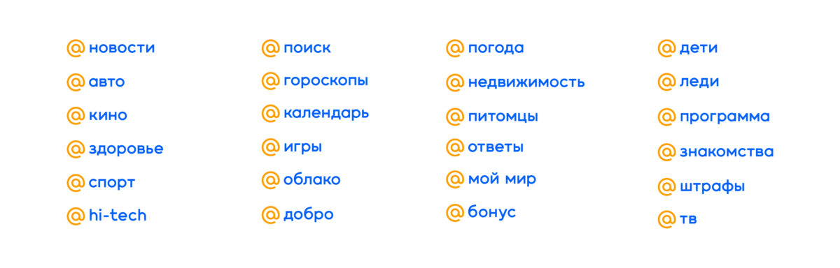
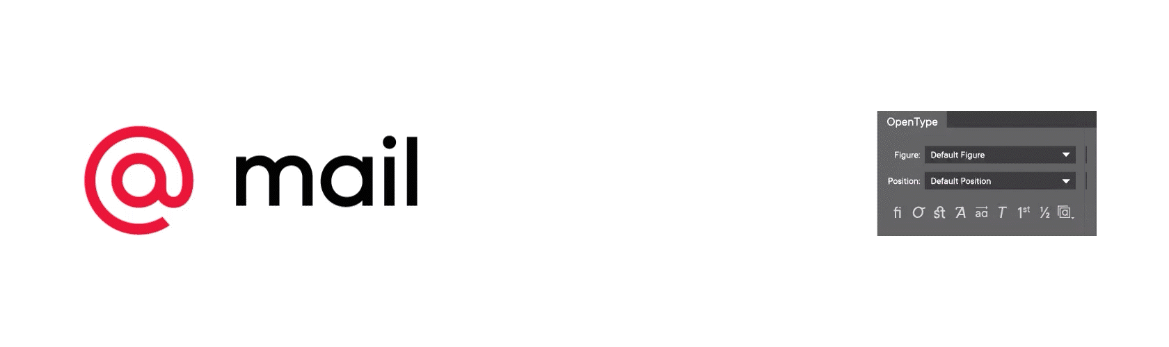
• Features were written in the process. Several contextual alternatives are used in the font, the most interesting is the @, which comes before the main logo and also the name of the company. When typing the combination @ mail.ru, the space after @ is reduced, in accordance with the brand logo.
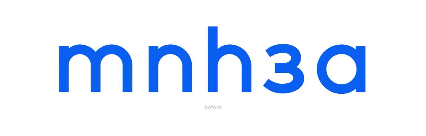
• Visual compensation, for which we tried to find a compromise throughout the entire cooperation —— letters with rounding. Mail.ru Group wanted to see a geometric font with a real circle, but we chose the format with visual compensation, in which the letter looks round, but does not get bold in the connecting parts. As a result, we were able to find an option that suited both parties. The same applied to letters with arches, that is, m, n, h, з and others.
At the final stage, technical preparation took place, kerning, which allowed the letters to perfectly match each other. Then we created font info and a technical review of the font file. All these processes were approved quickly, as by that time we had already reached complete mutual understanding.
Epilogue.
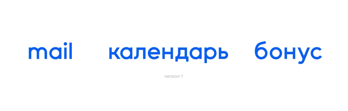
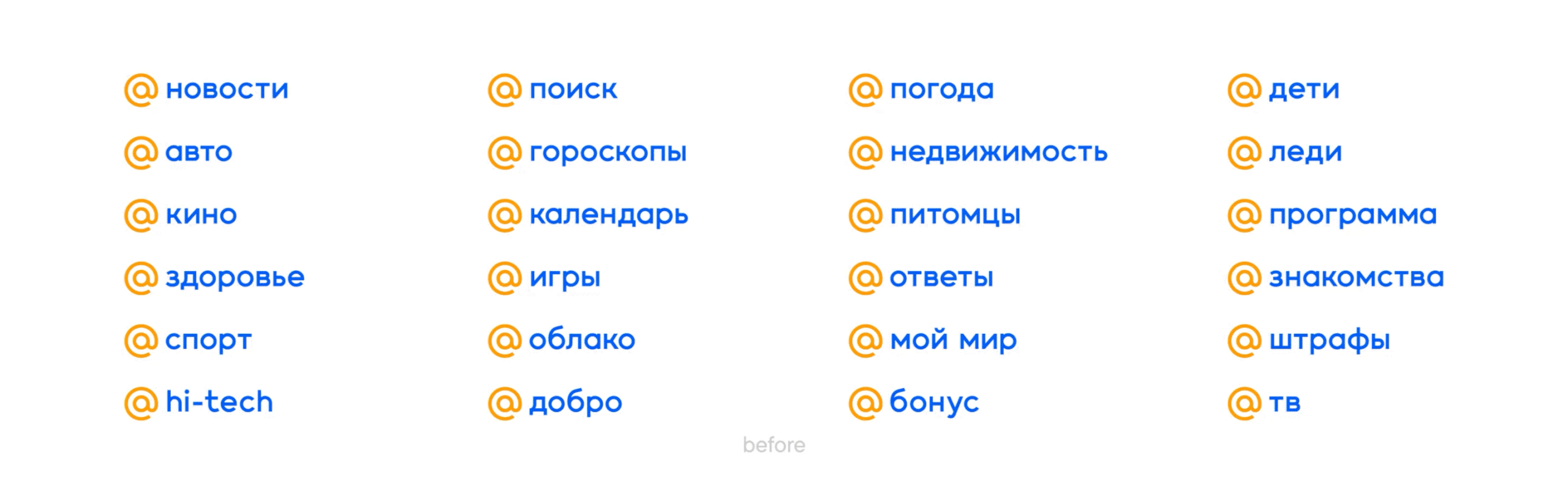
In March 2020, Mail.ru Group accepted the final version of the completed font for a set of logos. We ended up with a font based on the mail.ru logo, which the client uses to type logos in all of their services. The font became part of their corporate identity and fits perfectly into the brand concept.
Perhaps this story is a good example of how large projects are born from a small task in a dialogue, and everything ends well. The main thing is that each process participant is passionate about their work and is ready for any professional challenges.
We have established a trusting relationship with Mail.ru Group, and who knows, maybe one day we will tell you another story of cooperation with new challenges and discoveries?
People involved in the project:
• Vika Usmanova and Marina Khodak —— first stage designers.
• Yulia Gonina —— second and third stage designer.
• Victor Rubenko —— technical specialist.
• Irina Tatarskaya —— project manager.
• Ivan Gladkikh —— project manager.
• Evgeny Dolgov —— lead designer of the Mail.ru Group brand team.
• Mitya Osadchuk —— creative director of Mail.ru Group.
• Yuri Vetrov —— former design director of Mail.ru Group.